
When done right, data visualization can help your organization process and understand big buckets of information a lot more quickly. Instead of reading text or viewing lengthy reports about the data, visualizations are much easier to digest at a glance. They’re also much more memorable, which makes them useful for highlighting key takeaways and areas that need further investigation.
In this blog post, we’ll go through the best practices for using data visualization in Zoho so you can get the most out of this powerful tool in your organization. Much like any other business software, Zoho has its own set of pros and cons. These tips will help you leverage its benefits while sidestepping potential pitfalls.
Establish a Data Culture

Before you start implementing visualizations, it’s important to understand how your team approaches and uses data. If there isn’t a clear expectation around how and why data is being collected, it’ll be impossible to develop consistent visualizations that effectively communicate findings. A data culture will also help you avoid the trap of treating data as a siloed resource.
Data visualizations are much more effective when you combine them with other data sources to create a more holistic view of your organization. For example, if you’re already tracking customer data, you could create a visualization that plots the pain points customers experience on a map based on their location. This allows you to find insights into where you need to focus your attention.
Define What Good Visualizations Look Like
Before you dive into creating visualizations, it’s important to have a clear idea of what constitutes a good visual. A great visualization uses the full range of tools available to create an accurate, actionable snapshot of the data it represents. It’ll also be easy to understand and remember. You can get more out of your visualizations if you take a step back and consider what you want to accomplish with them before diving into a design.
To create effective visualizations, you need to understand your business goals and the data that support them. Once you have this information, you can begin thinking about how you’d like to visualize the data and how it’ll support your goals.

Use Dynamic Charts
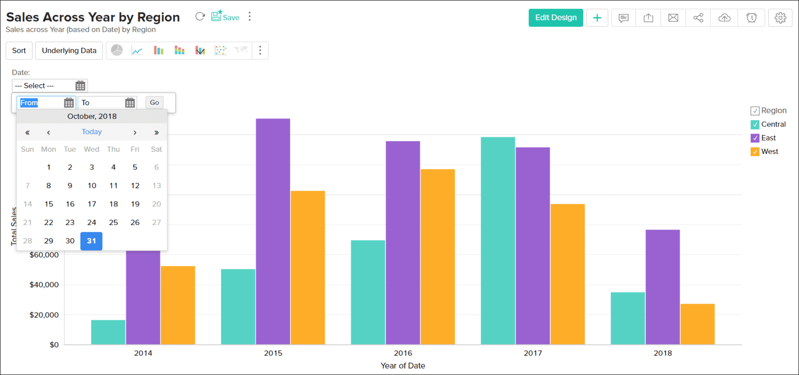
Charts are the most common type of visualization, and for good reason: they’re incredibly effective at communicating information. If you want to create static charts in Zoho, you can use the Table visualization tool to convert your data into a chart.
However, these aren’t as effective as using dynamic charts. A dynamic chart is a live visualization that updates in real-time as new data is added to your spreadsheet.
This allows you to track changes over time and identify trends that might otherwise go unnoticed. For example, if you’re tracking sales numbers, you can create a dynamic chart that plots daily sales over time. This makes it much simpler to spot trends, like sales spikes caused by seasonal events or holidays.
Add Labeling and Annotations
Visualizations are more effective if you add labeling and annotations to them. These tools allow you to explain what a particular visualization is showing, which makes the data easier to understand. They also create a sense of authenticity and ensure that your visualizations are trustworthy.
For example, if you’re creating a visualization that shows the top issues reported by customers, you could include a label that identifies the type of issues, as well as a text box explaining what these issues are. This allows your audience to quickly understand the visualization and draw conclusions from the data.
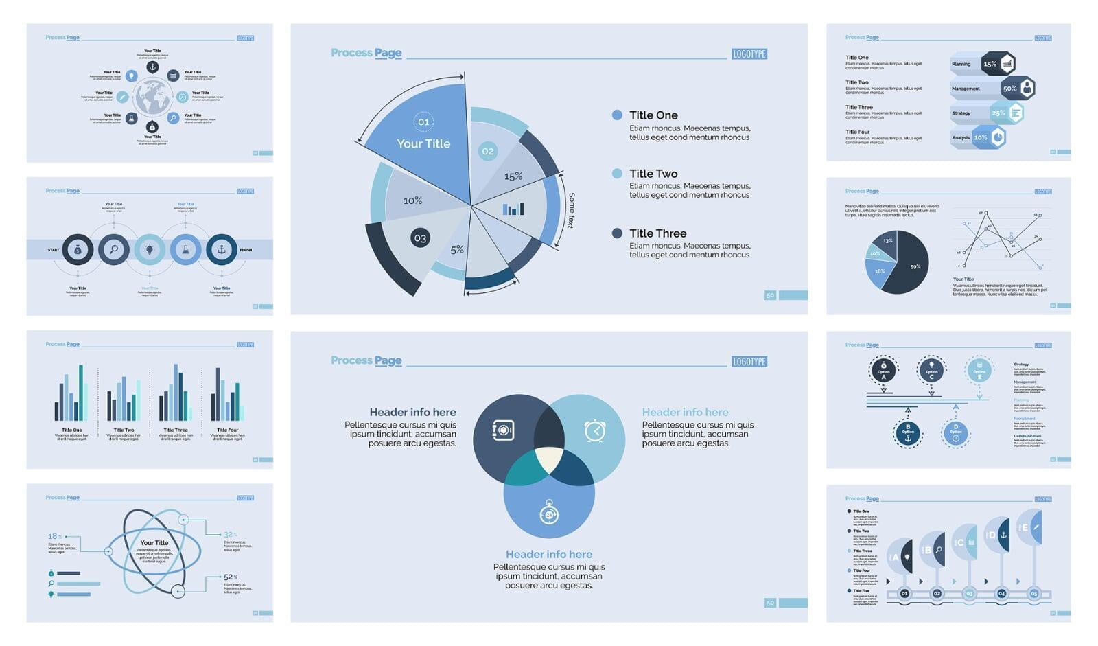
Choose The Right Type of Visualization
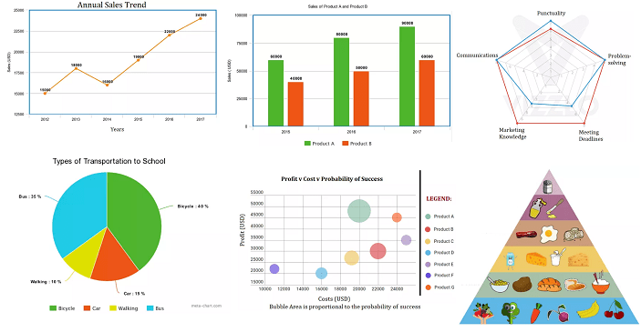
There are many types of visualizations, each with its strengths and uses. By choosing the right type of visualization for your given data, you can create more effective, memorable visuals that support your business goals.
There are six main types of visualizations: Bar charts, line graphs, pie charts, scatter plots, flowcharts, and waterfall charts. Now, these aren’t hard and fast rules, and there are a lot of different types of visualizations out there. However, they provide a general idea of which types of visualizations are best suited to communicating which types of data.
For example, bar charts work best for showing comparisons across different categories. They’re also great for comparing two sets of data, such as sales figures for two different product lines.
Be Selective with Colors
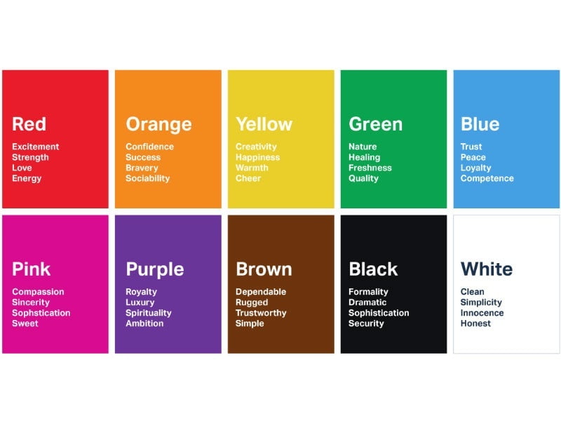
It’s easy to fall into the trap of using bright and colorful visuals just because you can, but that doesn’t always mean it’s the best decision. Using too many colors in your visualizations can reduce their effectiveness because it can make them harder to understand. Instead, choose one or two colors, and stick with them throughout your visualizations. This helps keep your visuals cohesive and makes it easier for your audience to focus on the data instead of trying to process a bunch of different colors at once.
Conclusion
Now, data visualization can be an incredibly powerful tool when done right, but it can also be detrimental if it’s not done well. If you follow these best practices, you’ll be able to create more effective visualizations that help you and your team process data more quickly and understand it better. If you’re looking for software that makes data visualization easy and accessible, try ZOHO. It’s a comprehensive business software platform that allows you to manage your business from start to finish, including data visualization.